
Atlantic Flamenco
Seville Spring Fair
Promotional Illustrations
Synopsis
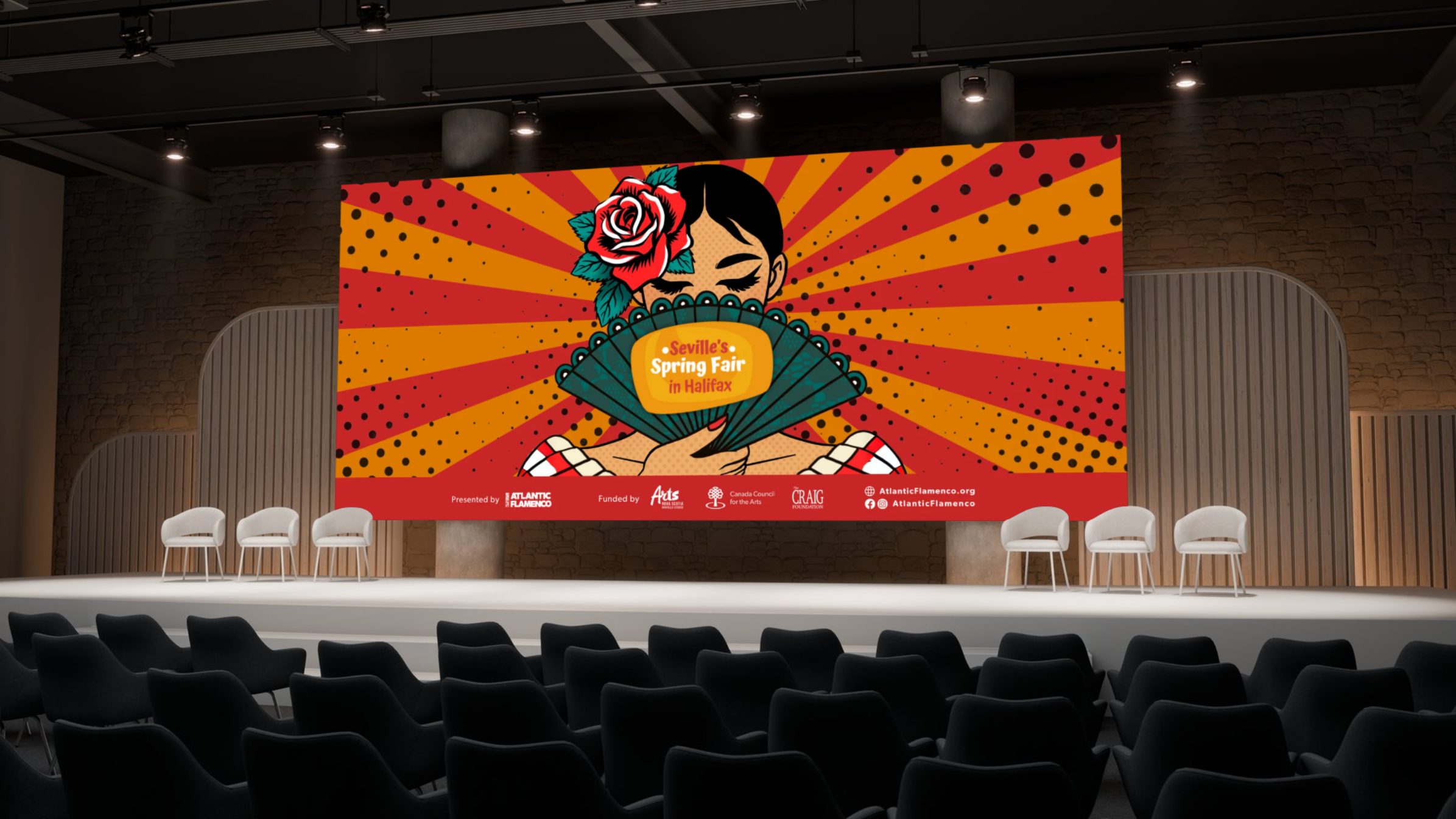
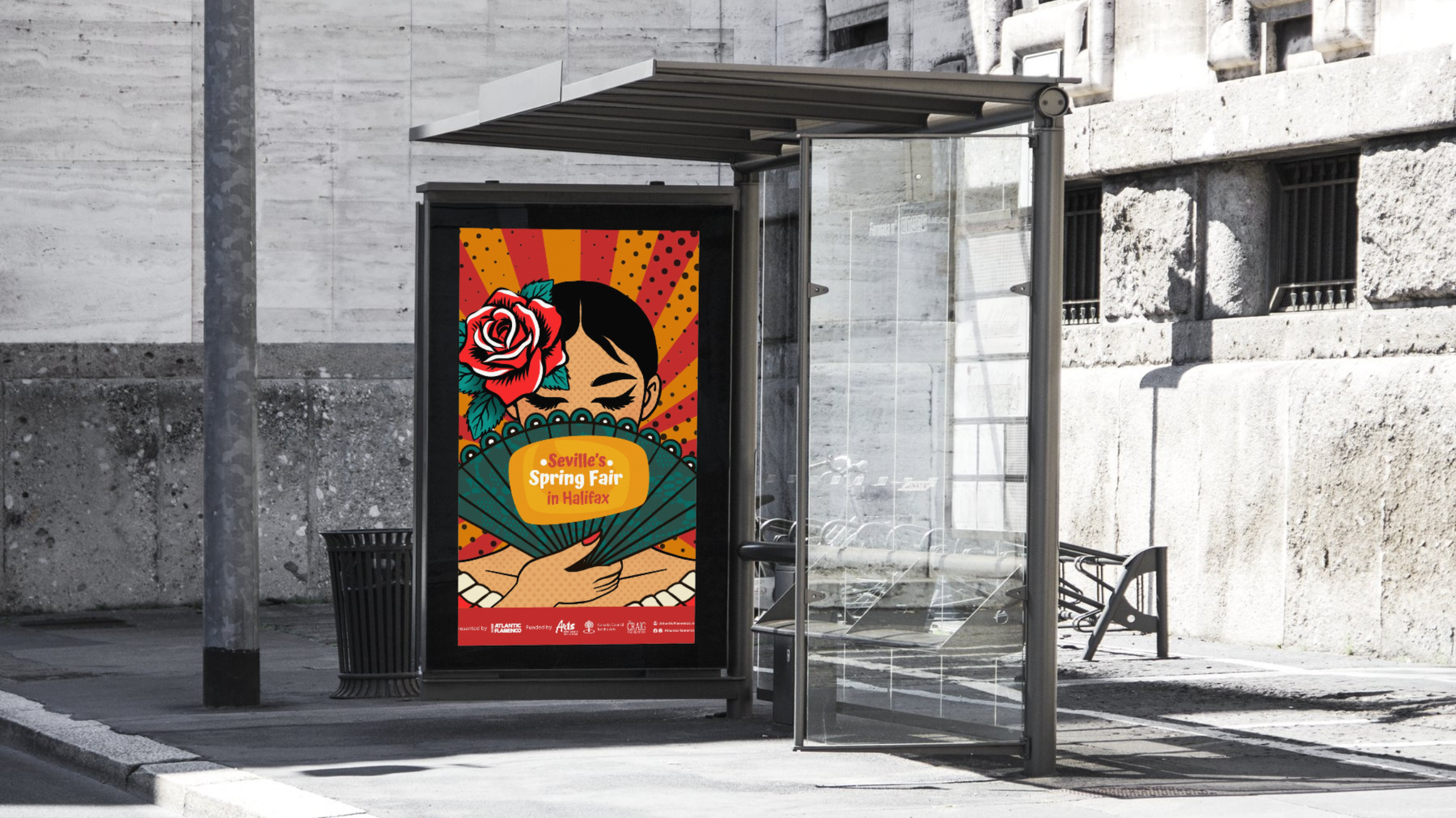
For Atlantic Flamenco's first Seville's Spring Fair, inspired by Seville's own Feria de Abril, the studio designed posters for the festival's three programs: Between Shores, a flamenco performance exploring ties between Canada and Spain, Family Fair Day, and Finding Common Ground, a cross-cultural dance workshop series.
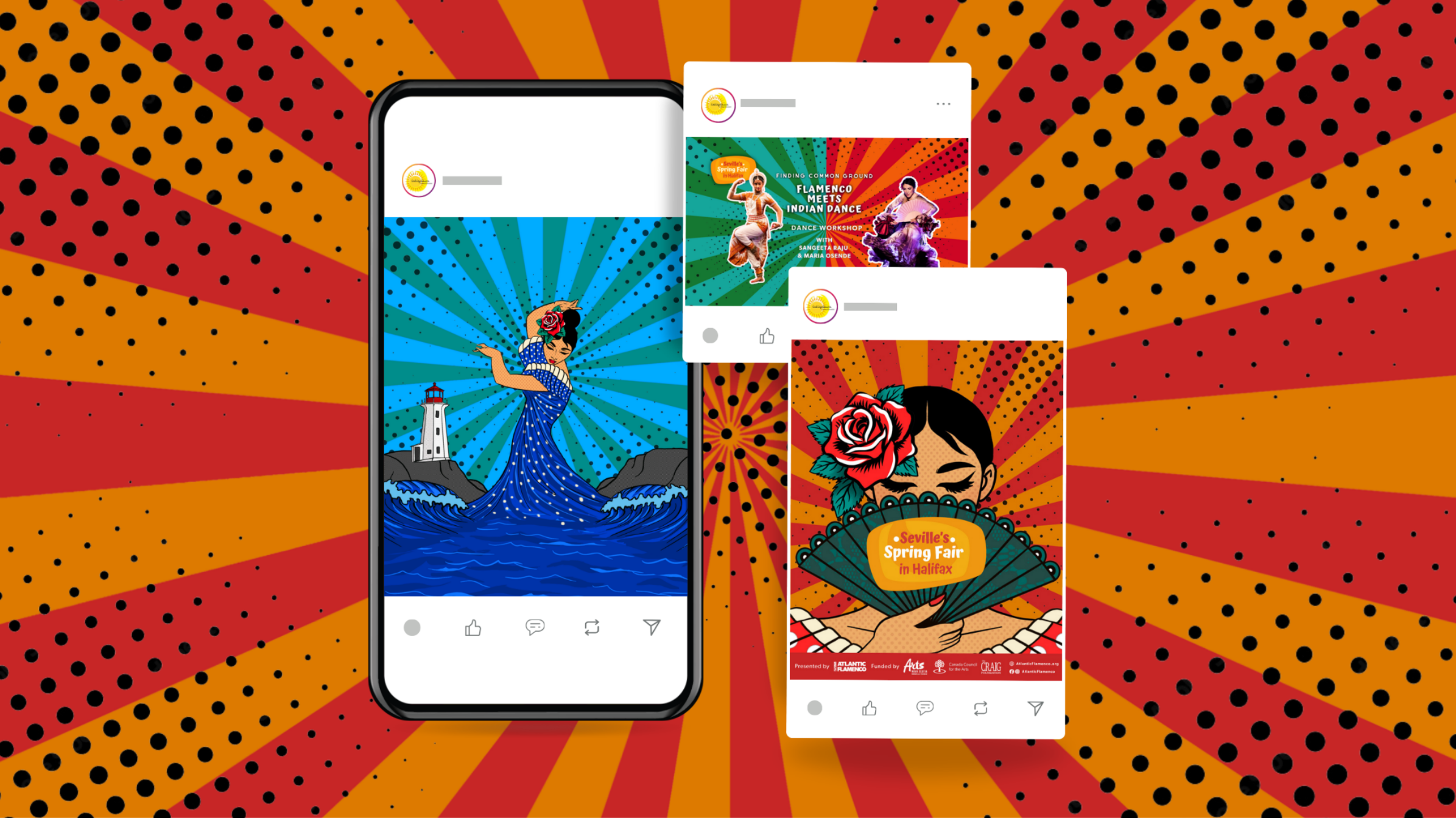
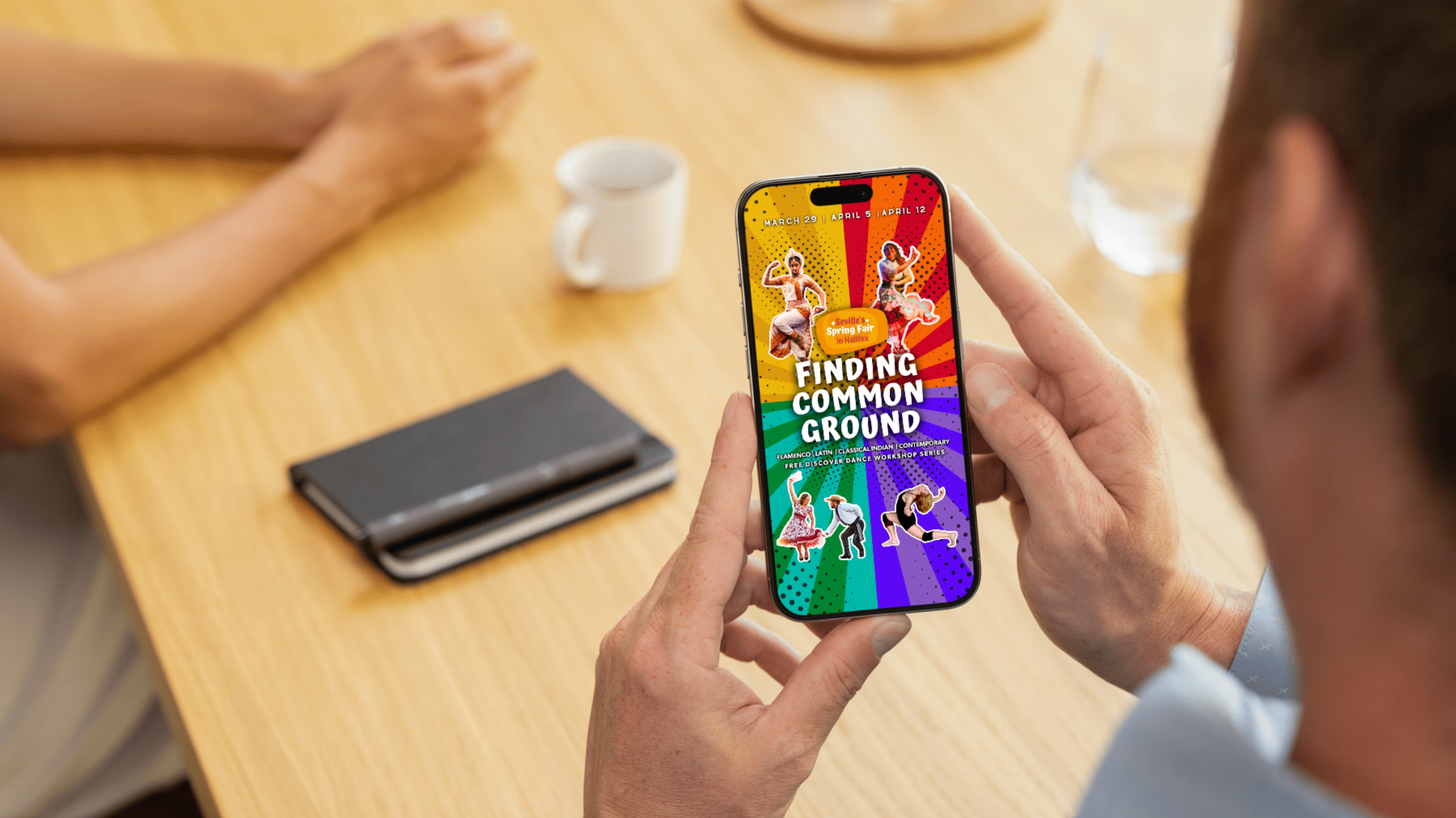
The designs drew on flamenco's own visual history, polka dots and vibrant colour, tracing the pattern's roots back to the Romani people and blending it with Pop art's bold, dotted style. For Finding Common Ground, real photos of the dance instructors replaced illustrated figures, giving clear information on who led each workshop, while keeping the same visual language across formats, from social media to print posters.
Between Shores sold out with over 230 attendees, and the workshops drew more than 50 participants combined.




-
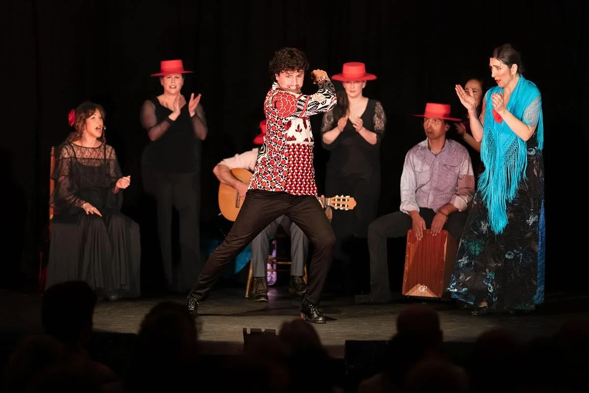
The festival had three parts: Between Shores, a choreographed dance and music performance by Maria Osende and her crew exploring the ties between Canada and Spain, tradition and innovation; a free Family Fair Day open to the whole community; and Finding Common Ground, a workshop series connecting flamenco with other dance traditions including Indian Odissi, Latin dance, and contemporary dance.
The challenge was designing posters for the main festival and the Finding Common Ground series that reflected flamenco's roots in centuries of cultural fusion. The posters needed to show that history along with its ongoing evolution across the Atlantic into North America, all while staying true to its origins.
-
The design leaned on flamenco's own visual history: polka dots and the vibrant red and yellow found in Spain's flag, paired with red from Canada's. The polka dot itself, known in Spanish as lunares or little moons, traces back to the Romani people, who once sewed small round mirrors onto their clothing to ward off bad luck and guide their way at night. That symbol later became a signature of flamenco dress. Inspired by the polka dots, the studio took another inspiration from Pop art to infuse the North American culture in it’s extensive use of dots and bright colours in artworks. The studio combined these two stories and also drew the woman holding a fan with a pop art style illustration.
For Finding Common Ground, the studio used real photos of the dance instructors instead of illustrated figures, giving clear, direct information about who was leading each workshop. The same visual language carried across both designs, adapted to fit different formats: social media, landscape banners, website graphics, and print posters.
-
The Finding Common Ground workshops came close to full capacity, drawing more than 50 attendees combined. Between Shores sold out, with over 230 people in attendance.
-
Poster Design
Illustration
Brand Identity Design
Cultural Representation
Flamenco & Dance History
Cross-Cultural Storytelling
Adobe Illustrator
Procreate